sigh, I don't even know why frizzer bothers. He makes updates, the community complains and then the community looks like assholes. The 3v3 ladder update was awesome but since then the updates haven't been what we asked for. Im still waiting for a decent way of communicating and seeing who is online. Its been too long.
Exactly, I've been getting increasing "invite your friends on Facebook" vibes from Warlight in the last year or so.
The app isn't even Warlight anymore, it's "Warlight, Risk, and Strategy." Doesn't make any god damn sense because it's all Warlight, looks like they're just trying to fit in a bunch of key words to attract NORMIES.
I really dislike the new design. The cards are harder to understand easily (before, the color code was very helpful that way to have a quick glance), and I'm not a fan of the design chosen. I know my opinion doesn't matter, but if this is a try or if there is a vote, I vote to bring back the old ones, or at least the option to use the old one.
I think the designs are fine, if we were going from these designs to the old ones, I imagine the outrage would be even greater. Obviously it will take time to get used to, and I guess these ones are help contribute to the atmosphere of diplomacy games.
it's a minor update. i'm done arguing about every recent update fizzer does, cause i dislike them all. i still Need to say, that it would be cool, if at least the edges would have different Colors so i can see what Card it is with one view.
The simplicty of warlight's aesthetic design (it almost looks rustic) is what gives it a unique charm. I don't like the cartoonish nature of the new cards. This is a serious strategy game.
Just like most everyone, I think the new card designs don't match with warlight, and are harder to recognize than the old cards. I'm sure we'll probably get used to them, or just get used to looking at the card names to see what they are. Either way, I still think they were a bad use of resources, especially when there are other items that people actually care about that could have been worked on.
Lets look at the usefullness of the new images... Fizzer changed the 1 v 1 template to SR to make it easier understandable to newbies, so his main goal is to attract more newbies. I welcome that, but the new images do exactly the opposite. They make the cards now even harder to understand.
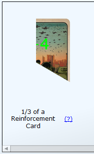
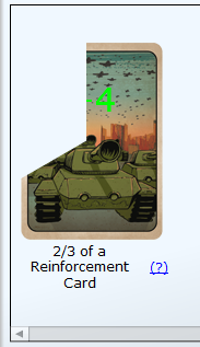
Reinforcements card: Used to be a simple green number, is now a tank with a green number - okay
Abandon card: Used to be a cycle crossed with a red line. Now its a soldier running away from a tank... as newbie I wouldnt associate that with anything good - bad change.
Spy-card: Used to be an easily understandable piktogramm of a Spy. Now its a guy in black cloths - argueable change.
OP-OD-cards. Used to be orange and brown arrows, which perfectly showed that the order happens earlier or later, are now an ambitious and lazy general - terrible decision here, Fizzer.
Airlift: Is still basically the same - okay
Gift-cars: Replacing a gift with a statue? - Seriously Fizzer??
Diplo-card: okay, basically no change - okay
Reconnaissance-card: midly good. But to be honest the old one wasnt really better... - argueable here.
Blockade card: Replacing the brick wall, with a soldier raising his hand, which implies that you would still keep control of the territory - TERRIBLE decision
I agree with people saying Warlight has moved away from its roots. Commanders, new cards, all these ideas for 'special units' - its all bullshit. Just play Civ or something. Warlight is Risk. Keep it that way.
Add me to the list of people that don't like them. The old cards were fine. You could tell them apart, you could tell what they did. "If it ain't broke, don't fix it" "Less is more" I could go on and on with time tested clichés.
the cards look ok, but it's hard to tell them apart from each other, would be nice to: a) add a distinguishing color to each of them to be easier to associate with actions b) have an option on the config pages to use the old style (lots of people will prefer the old)
I mean the cards are not great. Not enough distinction in the colours. I'll get used to it I guess. Get a better graphic designer next time or hold a contest with votes.
I like new style of design in overall, but some of them look really silly and without any connection to their in-game function. This goes for abandon,blockade,priority and delay cards especially. Gift card is lost in translation completely. I would be for several types of design and ability of players to choose amongst them... no chance for realization though :P
i believe this graphic change also goes in line with the previously announced direction of turning warlight into warzone. images are a lot more warfare explicit.
i would personally prefer a more tron / wargames art style to the whole site, but well, not my game.